Introduction
With the release of WordPress 5.0 we are going to see major updates in the editor and that editor name is Gutenberg. It replaces the classic editor and provides a good interface by using blocks.
In this Gutenberg WordPress tutorial we are creating a custom block for Gutenberg.
Not only will we be creating a Gutenberg block, but we will also dynamically load data into the back-end block editor and show this data on the front-end.
What is Gutenberg Block?
Gutenberg blocks are editable things just like other page builders have modules. Blocks have behavior based on the selection criteria. These are the core building blocks now in WordPress and are made primarily with JavaScript.
In this example we are going to create a custom block with React JS components and ESNext version of JavaScript. Gutenberg also supports ES5 style code as well.
Create a Custom Gutenberg Block
You can build your own custom block for any types of functionalities with the dynamic database content too. We are following the standard boilerplate structure provided in ‘create-guten-block’ tool. It is very similar to Creating React App.
npx create-guten-block my-blockThis command will create a WordPress block plugincd my-blockGo to the plugin directorynpm startRun the start script. Below will be the directory structure after you run commands.
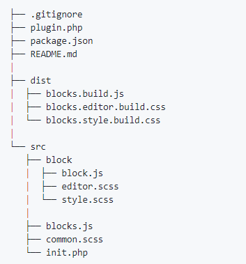
This runs the plugin in development mode. Before we move for the code part let’s take a look at the directory structure and roles of the different files in custom block.There is init.php file inside src directory that enqueue block assets like js and css our custom blocks. It includes two action hooks.
-
enqueue_block_assetsHook for front end to load js and css files.enqueue_block_editor_assetsHook for backend to load js and css files.
Other files and descriptions inside src directory
-
src/block/block.jsJavaScript file where we register our custom block.src/block/editor.scssThe styles for viewing the block within the Gutenberg editor.src/block/style.scssThe styles for the front-end appearance of the block.
Files inside the dist directory are files actually running and it has dependency on the src directory files. When you execute command npm run build it will move the final code to the files in dist directory. These files are actually enqueue in the hooks.
-
dist/blocks.build.jsFinal build JavaScript file where we register our custom block.dist/blocks.editor.build.cssFinal build styles for viewing the block within the Gutenberg editor.dist/blocks.style.build.cssFinal build styles for the front-end appearance of the block.
Enqueue Script & Style
So let’s start by enqueue the script and css files. Fortunately, create-guten-block sets these up for us already in init.php file.
function pwbm_shortcode_block_assets() {
   // Styles.
   wp_enqueue_style(
      'pwbm_shortcode_block-style-css',
      plugins_url( 'dist/blocks.style.build.css', dirname( __FILE__ ) ),
      array()
   );
}
// Hook: Frontend assets.
add_action( 'enqueue_block_assets', 'pwbm_shortcode_block_assets' );

function pwbm_shortcode_block_editor_assets() {
   // Scripts.
   wp_enqueue_script(
      'pwbm_shortcode-block-js',
      plugins_url( '/dist/blocks.build.js', dirname( __FILE__ ) ),
      array( 'wp-blocks', 'wp-i18n', 'wp-element','wp-editor' ),
      true
   );

   // Styles.element
   wp_enqueue_style(
      'pwbm_shortcode-block-editor-css',
      plugins_url( 'dist/blocks.editor.build.css', dirname( __FILE__ ) ),
      array( 'wp-edit-blocks' )
   );
}
// Hook: Editor assets.
add_action( 'enqueue_block_editor_assets', 'pwbm_shortcode_block_editor_assets' );
Register Block in Gutneberg
Now register custom block in my-block/src/block.js using registerBlockType()function.Every block starts by registering a new block type definition. The function registerBlockType()takes two arguments, a block name and a block configuration object.You can see list of all the block configuration object in Block API. For this demo we will implement only the required configuration objects.
We need to add some dependencies for our custom block at the top of the file block.js. These dependencies we added in the init.php file.
//  Import CSS.
import './style.scss';
import './editor.scss';
const { __ } = wp.i18n; // Import __() from wp.i18n
const { registerBlockType } = wp.blocks; // Import registerBlockType() from wp.blocks
const { Fragment } = wp.element;
const { BlockControls, AlignmentToolbar } = wp.editor;
var el = wp.element.createElement, withSelect = wp.data.withSelect;
Then add registerBlockType()function to register our custom block including required object parameters.
registerBlockType( 'pwbm/pwbm-shortcode-block', {
   title: __( 'PayPal Button Manager' ),
   icon: 'schedule',
   category: 'common',
   keywords: [
      __( 'angelleye' ),
      __( 'PayPal' ),
      __( 'PayPal Button Manager' ),
   ],
   attributes: {
      ae_pp_button: {
         type: 'string'
      },
      alignment: {
         type: 'string',
      }
   },
   edit: function() {
        return ( <p> Hello Editor </p> );
   }),
   save: function() {
       return ( <p> Hello saved </p> );
   })
});
Here pwbm/pwbm-shortcode-block is block name and it can only contain lowercase alphanumeric characters and dashes, and must begin with a letter. Other object parameters described in details in Block API. Once a block is registered, you should immediately see that it becomes available as an option in the editor inserter dialog, using values from title, icon, and category to organize its display.
titledisplayed in the editor as the searchable block label (string)icondashicons of WP or we can set custom JSX elementcategorywhere our custom block appears in Add block dialog (string)keywordsup to three keywords to search our custom block
registerBlockType()function.
edit and save functions are responsible for describing the structure of block’s appearance where attributes are used to implement Gutenberg’s state management system.
Merging all three together in work,edit function is responsible to manage the structure of Gutenberg editor and display the state of the element using the attributes and when user update or publish that post then it is turn of the save function to execute.
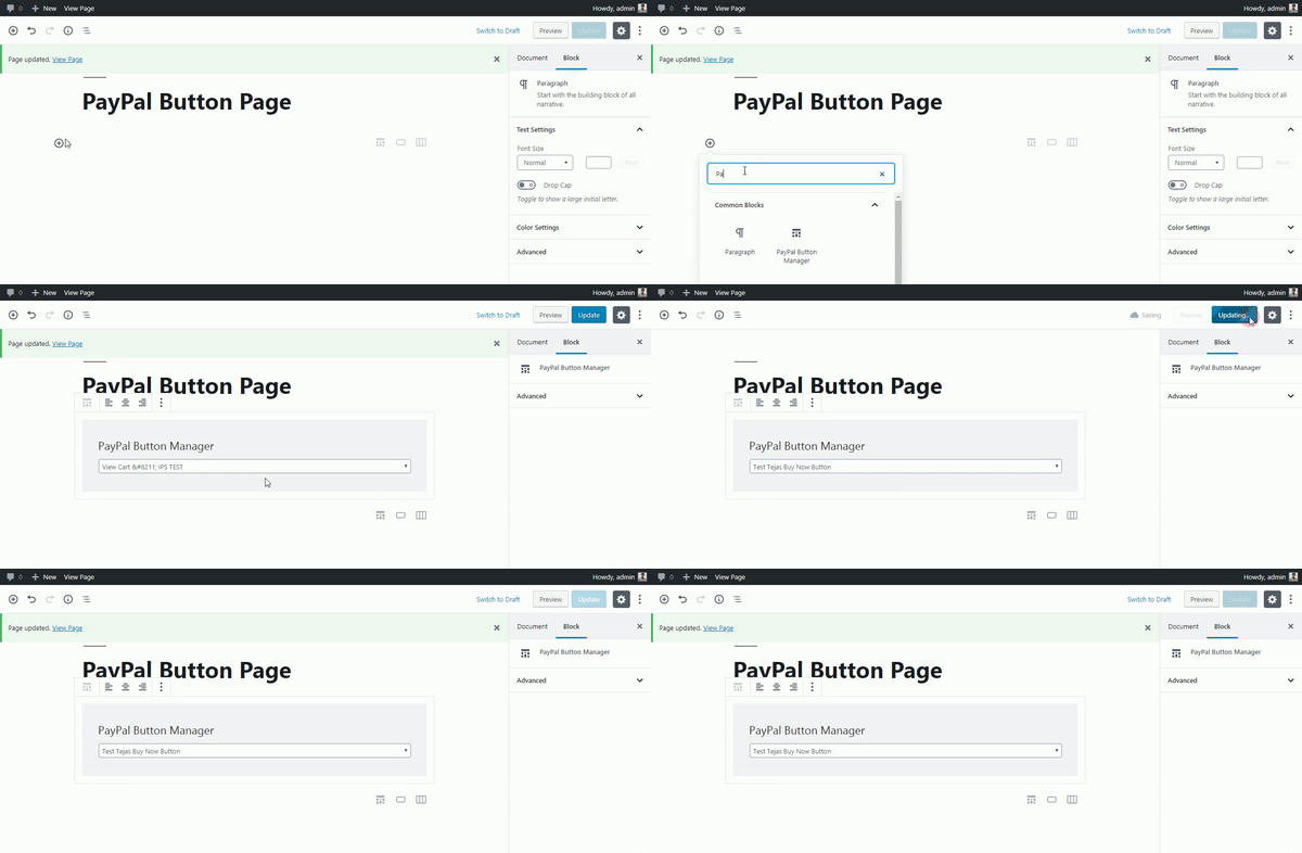
PayPal Button Manager Custom Block Gutenberg
- In our example we have post type
paypal_buttonsand it has list of created button by plugin PayPal Button Manager. - We will fetch all the buttons in our custom block and display the title and id in the drop-down as option name and value accordingly
- Selected value will be passed to the save function at the time of publish/update post and it will be fetch using the properties and attributes.
- We will make a shortcode using that id and it will store in database as page content and will displayed that button on that page.
Attributes
We have defined two attributes for our block ae_pp_button and alignment.
attributes: {
    ae_pp_button: {
        type: 'string'
    },
    alignment: {
        type: 'string',
    }
},
ae_pp_buttonattribute is responsible to fetch the selected post id from the dropdown & store it and can be available in the save function with the same id.alignmentattribute is responsible for the alignment of the output of our created PayPal Button.
Edit
In the edit functions we have added code for fetching the post type data and some event functions.Gutenberg introduce new way to fetch the records from the database. You can learn more about that in Data Reference Package. Dynamic data is passed to each block as props, including any custom attributes that have been defined. It’s common practice to add className={ props.className }to the main block element to output a CSS class specific to your block. WordPress doesn’t add this for you inside the editor, so it has to be added manually for each block if you want to include it. Generated format of that class is .wp-block-{namespace}-{name}so it can be modified if anyone wants to.
So we are going to break down edit function in three part.
- In that we have only used getEntityRecords function. We have used withSelect function, it will be called when we select our custom module from the list of block and inside that we have added code to fetch all the post with post type paypal_button and it will be populated in the dropdown.
edit: withSelect( function( select ) { return { posts: select( 'core' ).getEntityRecords( 'postType', 'paypal_buttons' )}; } ) - So
props.postshave all the records of our custom post type and then loop through the posts and fill up the dropdown options dynamically.<select className={'components-select-control__input'} value={ ae_pp_button } onChange={ setPPButton } > { props.posts.map( pp_post => { return ( <option key={pp_post.id} value={pp_post.id}> {pp_post.title.rendered} </option> ) } ) } </select> - On change of the dropdown, we are calling
setPPButtonfunction that is responsible to set the value of selected option inae_pp_buttonattribute.function setPPButton( event ) { const selected = event.target.querySelector( 'option:checked' ); setAttributes( { ae_pp_button: selected.value } ); event.preventDefault(); }
We have Block Controls added in the script. For our example we have only added one block control that is for alignment. We have already defined that in the start of the block.js file as
const { Fragment } = wp.element;
const { BlockControls, AlignmentToolbar } = wp.editor;
And inside the edit function we can use it within BlockControls tag and it can be displayed with the AlignmentToolbar with the value attributes on it.
<BlockControls>
<AlignmentToolbar value={ alignment } onChange={ onChangeAlignment } />
</BlockControls>
On change of that alignment tool, we will call onChangeAlignment function that is responsible for our custom block to align left, right and center of the area.
function onChangeAlignment( newAlignment ) {
setAttributes( { alignment: newAlignment } );
event.preventDefault();
}
Combining all the functionalities together our edit function will be look like this
edit: withSelect( function( select ) {
return { posts: select( 'core' ).getEntityRecords( 'postType', 'paypal_buttons' )};
} )( function( props ) {
if ( ! props.posts ) {
return __("Loading...");
}
if ( props.posts.length === 0 ) {
return(
<Fragment>
<BlockControls>
<AlignmentToolbar
value={ alignment }
onChange={ onChangeAlignment }
/>
</BlockControls>
<div className={ props.className }>
<p className={'ae_pwbm_p'}>{ __(‘PayPal Button Manager’) }</p>
<form onSubmit={ setPPButton }>
{__("No PayPal Button found.")}
</form>
</div>
</Fragment>
);
}
const { attributes: { ae_pp_button,alignment }, setAttributes } = props;
if (ae_pp_button === undefined) {
setAttributes({ae_pp_button: props.posts[0].id});
}
function setPPButton( event ) {
const selected = event.target.querySelector( 'option:checked' );
setAttributes( { ae_pp_button: selected.value } );
event.preventDefault();
}
function onChangeAlignment( newAlignment ) {
setAttributes( { alignment: newAlignment } );
event.preventDefault();
}
return(
<Fragment>
<BlockControls>
<AlignmentToolbar
value={ alignment }
onChange={ onChangeAlignment }
/>
</BlockControls>
<div className={ props.className }>
<p className={'ae_pwbm_p'}>{ __(‘PayPal Button Manager’) }</p>
<form onSubmit={ setPPButton }>
<select className={'components-select-control__input'} value={ ae_pp_button } onChange={ setPPButton } >
	{
		props.posts.map(
			pp_post => {
				return (
					<option key={pp_post.id} value={pp_post.id}>
						{pp_post.title.rendered}
					</option>
				)
			}
		)
	}
</select>
</form>
</div>
</Fragment>
);
} ),Save
This method defines how you want your block to be displayed on the front-end. Till now we made code is for the editor and will be displayed on the backend but we need to save that layout. In our example we will fetch that id of the post from the selected option from the select tag and merge the id with it like PayPal Button Manager shortcode and it will be saved on the page using save()function in block.js
save: function( props ) {
const { attributes: { ae_pp_button,alignment } } = props;
return (
<div style={{ textAlign: alignment }}>
{'[paypal_wp_button_manager id='+ae_pp_button+']'}
</div>
);
}
In this we can fetch the attributes values we set in the edit() functions and apply it on the front end also.And with the selected id of post we will apply to the shortcode as shown above and it will store in database as[paypal_wp_button_manager id='1'] so it will display the button according to the shortcode saved in the database. save() method is much easier than edit method because it just need to get the values of the attributes and store in db.
So combining everything in one file
Block.js
/**
* BLOCK: PayPal Button Manager Gutenberg Block
*/
// Import CSS.
import './style.scss';
import './editor.scss';
const { __ } = wp.i18n; // Import __() from wp.i18n
const { registerBlockType } = wp.blocks; // Import registerBlockType() from wp.blocks
const { Fragment } = wp.element;
const {
BlockControls,
AlignmentToolbar,
} = wp.editor;
var el = wp.element.createElement,
withSelect = wp.data.withSelect;
/**
* Register: aa Gutenberg Block.
*/
registerBlockType( 'pwbm/pwbm-shortcode-block', {
title: __( 'PayPal Button Manager' ),
icon: 'schedule',
category: 'common',
keywords: [
__( 'angelleye' ),
__( 'PayPal' ),
__( 'PayPal Button Manager' ),
],
attributes: {
ae_pp_button: {
type: 'string'
},
alignment: {
type: 'string',
}
},
edit: withSelect( function( select ) {
return {
posts: select( 'core' ).getEntityRecords( 'postType', 'paypal_buttons' )
};
} )( function( props ) {
if ( ! props.posts ) {
return __("Loading...");
}
if ( props.posts.length === 0 ) {
return(
<Fragment>
<BlockControls>
<AlignmentToolbar
value={ alignment }
onChange={ onChangeAlignment }
/>
</BlockControls>
<div className={ props.className }>
<p className={'ae_pwbm_p'}>PayPal Button Manager</p>
<form onSubmit={ setPPButton }>
{__("No PayPal Button found.")}
</form>
</div>
</Fragment>
);
}
const { attributes: { ae_pp_button,alignment }, setAttributes } = props;
if (ae_pp_button === undefined) {
setAttributes({ae_pp_button: props.posts[0].id});
}
function setPPButton( event ) {
  const selected = event.target.querySelector( 'option:checked' );
  setAttributes( { ae_pp_button: selected.value } );
  event.preventDefault();
}
function onChangeAlignment( newAlignment ) {
setAttributes( { alignment: newAlignment } );
event.preventDefault();
}
return(
<Fragment>
<BlockControls>
	<AlignmentToolbar value={ alignment } onChange={ onChangeAlignment } />
</BlockControls>
<div className={ props.className }>
<p className={'ae_pwbm_p'}>PayPal Button Manager</p>
<form onSubmit={ setPPButton }>
<select className={'components-select-control__input'} value={ ae_pp_button } onChange={ setPPButton } >
{
props.posts.map(
pp_post => {
return (
<option key={pp_post.id} value={pp_post.id}>
{pp_post.title.rendered}
</option>
)
}
)
}
</select>
</form>
</div>
</Fragment>
);
} ),
save: function( props ) {
   const { attributes: { ae_pp_button,alignment } } = props;
   return (
	   <div style={{ textAlign: alignment }}>
		   {'[paypal_wp_button_manager id='+ae_pp_button+']'}
	   </div>
   );
},
} ); // End of registerBlockType
Once all the functionalities works properly we need to generate the production build of that code by simply running npm run build command in the root directory of your plugin. Production build files will be in dist directory as blocks.build.js, blocks.editor.build.css, blocks.style.build.css and you can use it in your theme or existing plugin by enqueue it.
Finishing up
There you have it your own custom block. We can make many more block and functionalities like this and some of the custom blocks have extremely good functionalities. One advice here that you should have at least little knowledge of React js before diving into the Gutenberg custom block. We have only covered few of the functionalities for our custom block but you can expand it more and then give well deserved pat in your back. If you want to see the working example of this code download our popular plugin PayPal Button Manager.
Looking for Live Help?
Schedule a live meeting with Drew Angell, PayPal Certified Developer, and get all of your questions or concerns answered.
Featured PayPal Products and Services
-
PayPal Support
$150.00 -
PayPal for WooCommerce
FREE! -
WooCommerce Multiple PayPal Accounts Plugin
FREE! -
PayPal Shipment Tracking for WooCommerce
$49.99 -
Offers for WooCommerce
$59.99 -
WordPress PayPal Invoice Plugin
$20.00 -
PayPal Webhooks for WordPress
$79.99 -
Sale!
PayPal IPN for WordPress
Original price was: $59.99.$49.99Current price is: $49.99.

